Cash register mobile app
Project overview
The product
The Cash Register app helps vendors and artisans, such as candle makers, to sell their products at live events and track their sales and inventory.
Project duration
December 2022 to July 2023
The problem
Busy part-time artisans don’t have much time to devote to the business aspects of their craft.
The goal
Design an app that allows artisans to easily ring up and track the products they sell.
My role
UX designer designing a cash register app from conception to delivery.
Responsibilities
Conducting interviews, paper and digital wireframing, low and high-fidelity prototyping, conducting usability studies, accounting for accessibility, and iterating on designs.


User research
Summary
I conducted interviews and created empathy maps to understand the users I’m designing for and their needs. A primary user group identified through research was hobbyist craftspeople who sell their products at special events.
Research revealed that this user group has many responsibilities outside of their craft. Because of this, they could benefit from automating or streamlining their business processes, from one-time tasks such as programming items into the cash register, to ongoing tasks such as updating inventory.
Pain points
Time
Vendors are too busy to spend a lot of time setting up cash registers
Accessibility
Existing cash registers can be difficult to learn to use and lack assistive technology
Additional work
After the sale, vendors still need to log sales and update inventory.
Persona: Jess
Problem Statement
Jess is a hobbyist candlemaker who needs a quick and easy way to ring up and track the candles they sell because they don’t have much time to dedicate to the business side of candle making.

User journey map
Mapping Jess’s user journey revealed how helpful it would be for users to have an app to ring up purchases and automatically adjust inventory and sales numbers.

Paper wireframes
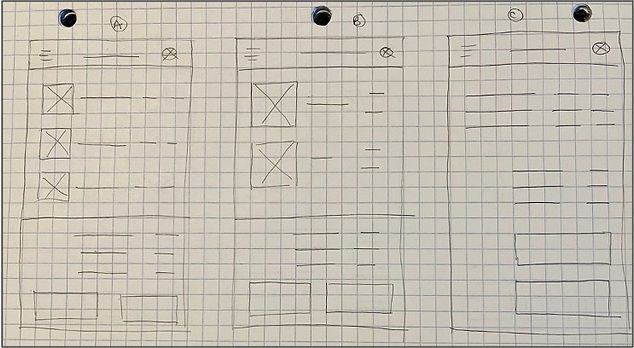
Taking time to draft iterations of each screen on paper ensured that the elements included in the digital wireframes were well-suited to address user pain points. For the checkout screen, I prioritized a simple layout that included images for confirmation at a glance.

Digital wireframes
As the initial design phase continued, I made sure to base screen designs on feedback and findings from user research.
Product images make it easier to select the right product.
This button makes it fast and easy to check out.


Use of Gestalt principles makes it easy to see the product details

Usability studies
I conducted two rounds of usability studies. The first study used a low-fidelity prototype, and the findings guided the designs from wireframes to mockups. The second study used a high-fidelity prototype and revealed which aspects of the mockups needed to be refined.
Round 1 findings
Users need better cues that a report is complete.
Users need a more intuitive way to add items to a purchase.
Users need better cues for what steps are required to ring up a purchase.
Round 2 findings
Users need a clearer label on the inventory button.
Users need a clearer label on the reports button.
Users need a way to export reports.
Mockups
Early designs offered fewer cues about how to add an item to a purchase. After the usability studies, I added more prominent “Add” buttons and a running count of the items in the purchase, so that users can clearly see when an item has been added.
Before usability studies
After usability studies


The second usability study revealed confusion with the buttons on the home screen. I made the button for the most common task more prominent, and created additional buttons with more descriptive labels for less frequent tasks.
Before usability study 2

After usability study 2


Accessibility considerations
The colors used in this design provide sufficient contrast for people with limited color vision.
This design uses icons and images, which help users who have difficulty processing words t make the right selection.
The design also includes text labels for icons and images, so that users who use a screen reader can access the app.
Takeaways
Impact
Ringing up purchases can be stressful or monotonous. The app helps makes this task easier and more enjoyable.
One quote from user testing:
”I liked ringing up a purchase. It was really clear and fun!”
What I learned
While designing the app, I learned the importance of usability testing. Putting my designs in front of real users revealed areas for improvement that I never could have predicted on my own.
Next steps
Conduct another usability study to validate whether the pain points uncovered in earlier testing have been effectively addressed.
Conduct additional user research to determine whether there are any new areas of need.