Study partner finder website
Project overview
The product
Design University is a fictional online design school. Many of its student are busy with jobs and other responsibilities. Study Partners at DU is a website that helps match students with study partners according to their schedules and preferences..
Project duration
August 2023 – September 2023
The problem
Students must fit in studying around their busy schedules. Other online study partner finders do not include availability as a search option, and they have limited functionality for specifying a course.
The goal
Design a study partner website for Design University to be user friendly by providing clear search flow that filters potential partners based on course and availability.
My role
Solo UX designer and researcher


Responsibilities
Conducting interviews, paper and digital wireframing, low and high-fidelity prototyping, conducting usability studies, accounting for accessibility, iterating on designs and responsive design.
User research
Summary
I conducted user interviews, which I then turned into empathy maps to better understand the target user and their needs. I discovered that many target users have trouble finding a study partners that are available to study at the same times as they are. Additionally, some target users feel awkward about approaching classmates to partner up. Because of this, they could benefit from a website that gives them access to potential study partners who have similar schedules and have already indicated their willingness to be a partner.
Pain points
Relevance
Most other study partner websites are available to the general public, which makes it difficult to to find partners for specific courses offered by Design University.
Scheduling
Other websites do not offer the ability to filter potential partners by their availability, so users are sometimes matched with partners they can never meet with because of scheduling difficulties.
Confidence
Contacting a classmate directly can be daunting for shy users who are not sure whether the classmate will be receptive to being study partners.
Persona: Nadia
Problem Statement
Nadia is a busy student and employee who needs to find a study partner with a similar schedule because she is only available to study during certain times of day.

User journey map
I created a user journey map of Nadia’s experience finding a study partner to help identify possible pain points and improvement opportunities.

Sitemap
I created a sitemap with the goal to make navigation simple and easy. I made strategic information architecture decisions that improve overall website structure.

Paper wireframes
Next, I sketched out paper wireframes for each screen in my user flow, keeping the pain points in mind.
The home screen paper wireframe variations shown here focus on easy navigation and quick access to study partners.
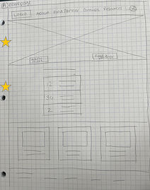


Stars were used to mark the elements of each sketch that would be used in the initial digital wireframes.

Paper wireframe screen size variations
Because Design University students access the site on a variety of different devices, I started to work on designs for additional screen sizes to make sure the site would be fully responsive.


Digital wireframes

Moving from paper to digital wireframes made it easy to understand how the design could improve the user experience.
Prioritizing visual element placement on the home page was a key part of my strategy.
Prominent buttons make it easy to get started
Quick access to existing partners
A wizard-like flow for finding a study partner prioritized easy selection of criteria important to users, like course and availability.


Digital wireframe screen size variations
Desktop

Mobile

Low-fidelity prototype
To create a low-fidelity prototype, I connected all of the screens involved in the primary user flow of creating a profile and finding a partner.

Usability study
Parameters
Study type
Moderated
Location
United States, remote
Participants
5
Length
10-15 minutes
Findings
Login
Users were often unsure whether they were logged in or logged out, and what they should expect in either state.
Course Selection
Users couldn’t tell whether they should select one or multiple courses while searching for a partner.
Message confirmation
Users were uncertain whether their message to a potential partner had been sent.
Mockups
Based on the insights from the usability study and feedback from peer reviews, I made changes to improve user orientation. I created two different versions of the home page: one with general information for when a user is logged out, and one with user-specific information for when the user is logged in.
Before usability study

After usability study


To make the process of inviting a classmate to be partners clearer, I changed the flow and provided a confirmation message, so that users understood that the action was complete and knew what to expect next.
Before usability study
After usability study


Original screen size


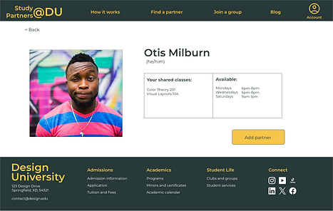
Screen size variation
I included considerations for additional screen sizes in my mockups based on my earlier wireframes. Because users access the website from a variety of devices, it was important to optimize the browsing experience for a range of device sizes.


Accessibility considerations
I used headings with different sizes and weight of text to show visual hierarchy.
I designed the site with alt text available on each page for users who use screen readers.
I used landmarks to help users navigate the site, including users who rely on assistive technologies.
Takeaways
Impact
Users found the design easy to navigate and understand. According to one peer reviewer:
"The way it's laid out makes sense to me."
What I learned
I learned that small changes can make a big difference on the user experience, and that it’s important to focus on the real needs of users.
Next steps
Conduct follow-up usability testing on the new website
Identify any additional areas of need and ideate on new features